Department for Education
SERVICE DESIGN
CX DESIGN
USER RESEARCH
SERVICE DESIGN
CX DESIGN
USER RESEARCH
IMPROVING CUSTOMER EXPERIENCE FOR LEARNERS AND EMPLOYERS - FURTHER EDUCATION REFORM
Redesigning the Customer Experience for Learners and Employers across DfE, as part of the Department’s Further Education Reform.
As part of a newly formed Customer Experience team, my role was to increase uptake of learners and employers enrolling in Further Education schemes. Using a user-centred design process to improve and simplify their journey end-to-end.
I researched the key barriers preventing us from meeting our user’s needs, and prototype digital products and solutions which enable us to do so.
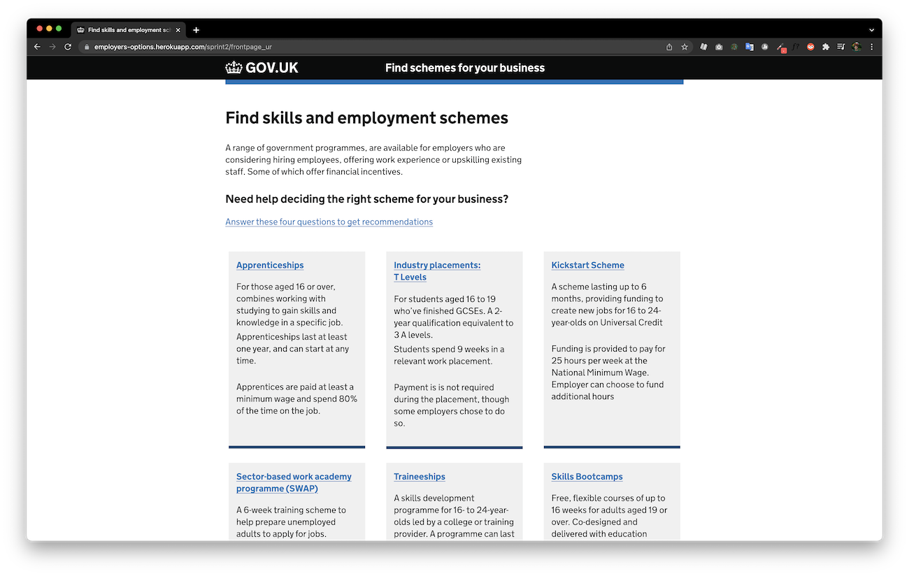
In 6 months with a working team of only 5, we executed an extensive project from discovery through to launch of an advisory website for employers.
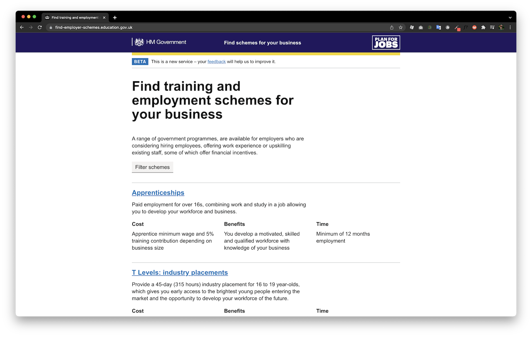
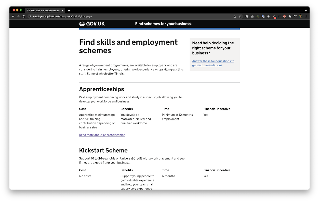
The site provides them a ‘front door’ into all available government-funded training options and the necessary information to hire apprentices and other employee-training options.
The site was a resounding success and is still currently in use. Click here to view the find-emplyer-schemes site.
Research
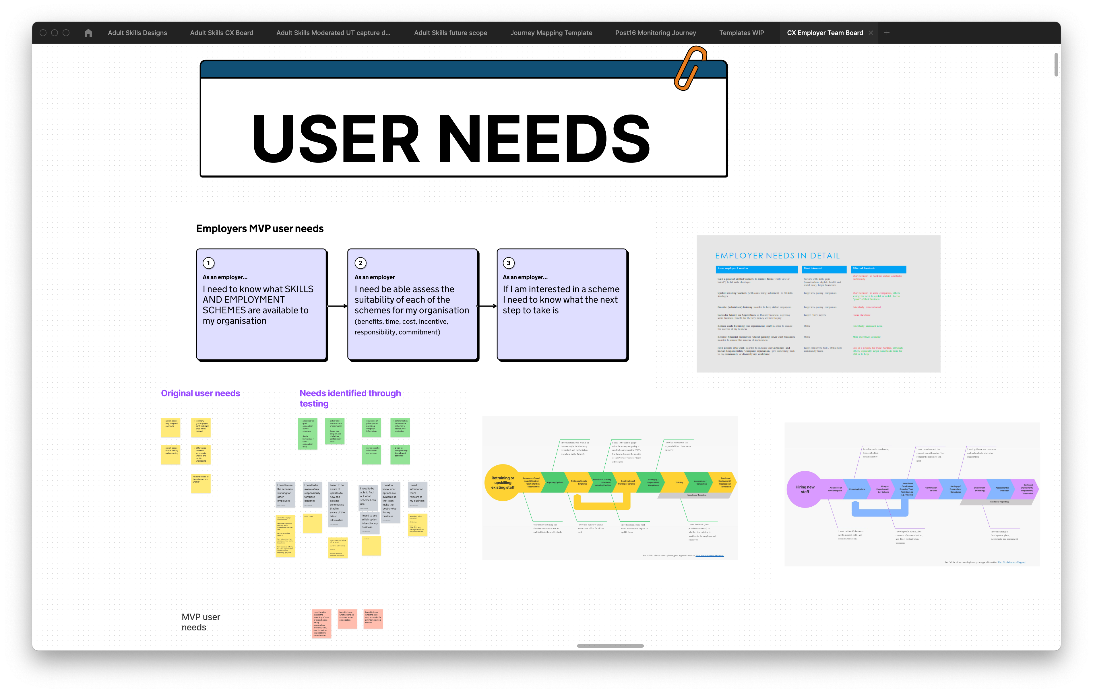
user needs and co-creation workshops
I conducted over 50 interviews with internal and external stakeholders to better understand the training-in-employment landscape.
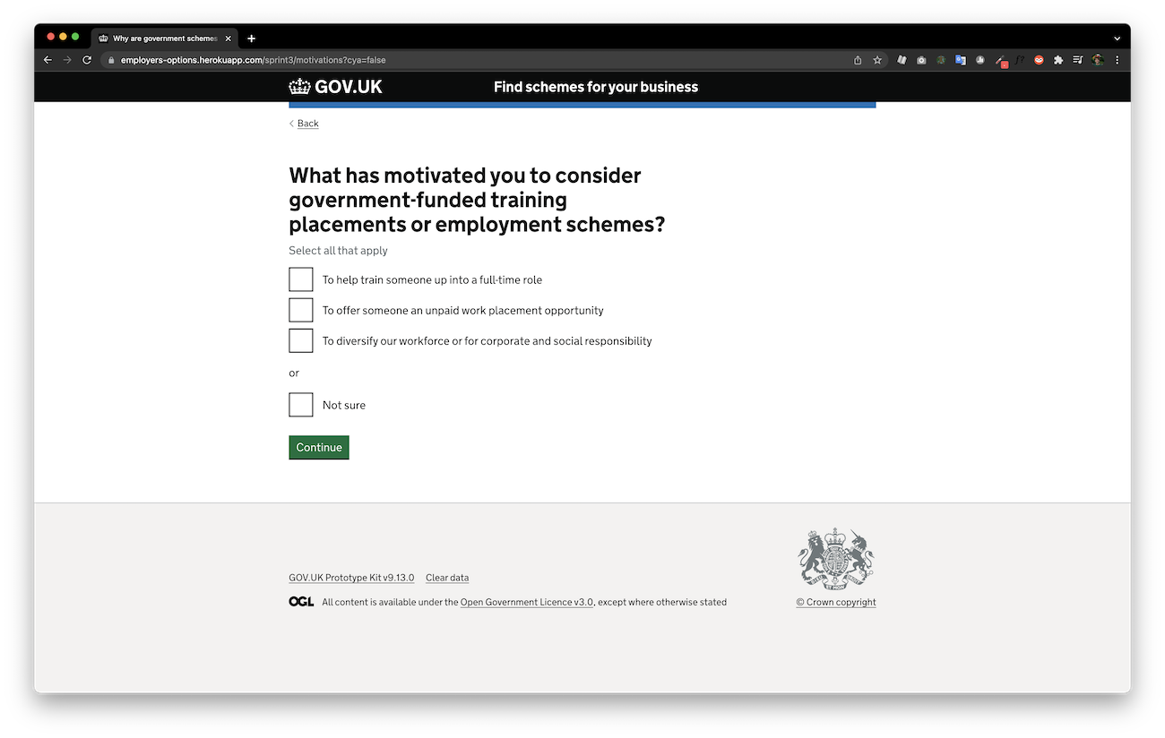
I facilitated workshops to gather user needs and identify problems from the people who know them best - employers, and the administrative staff of the DfE.
Later co-creation workshops were used to generate and develop ideas which overcome the identified problems.
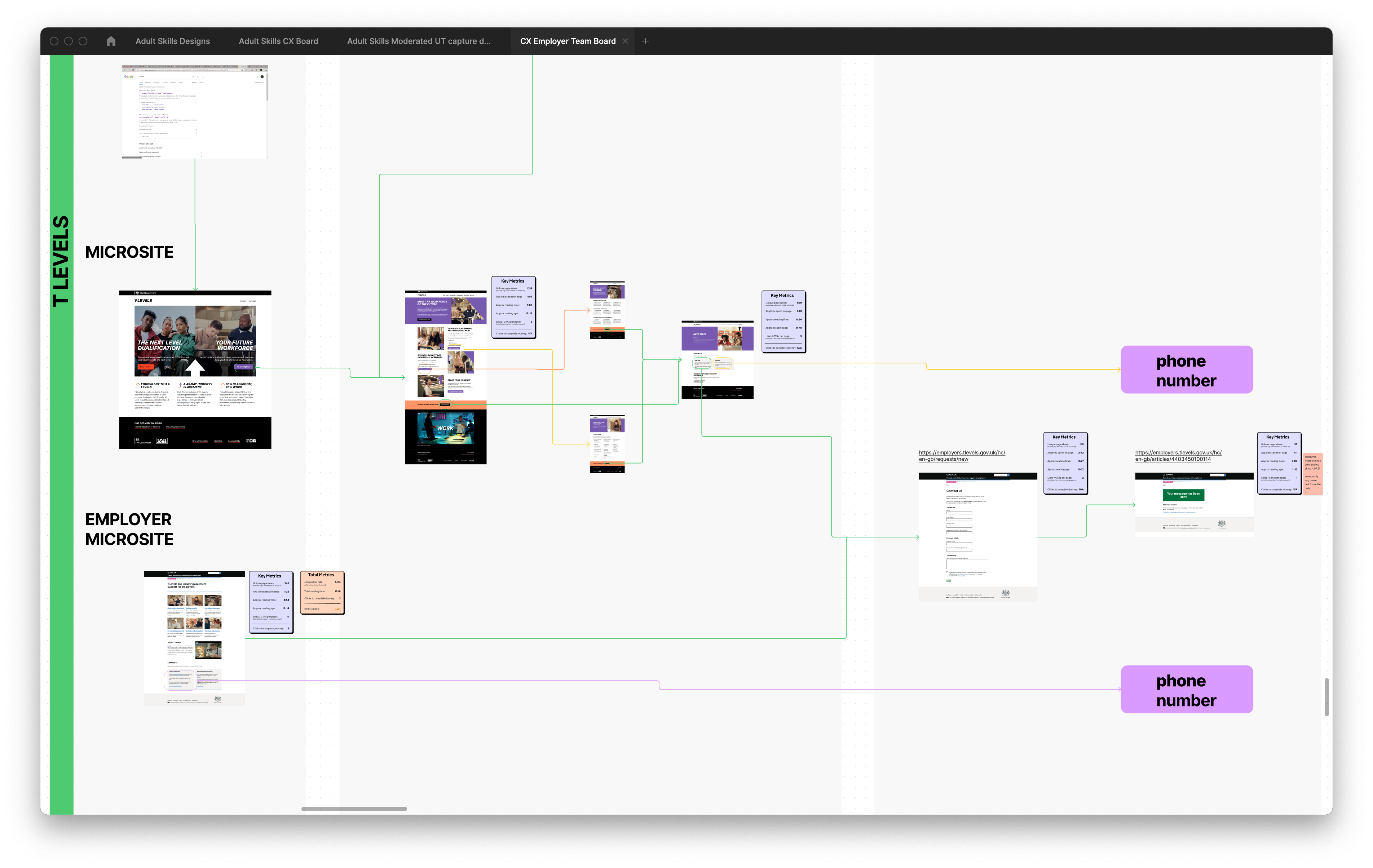
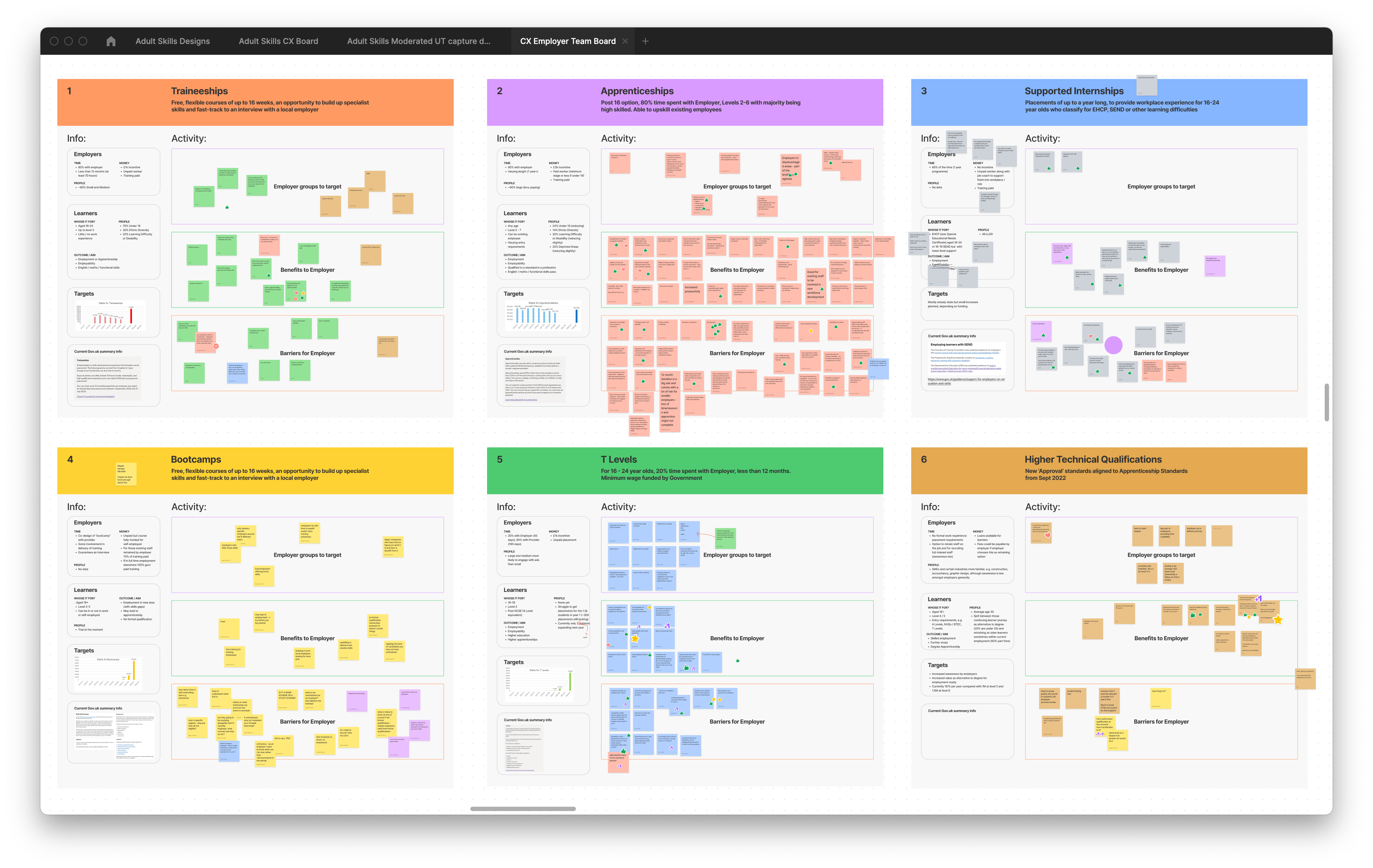
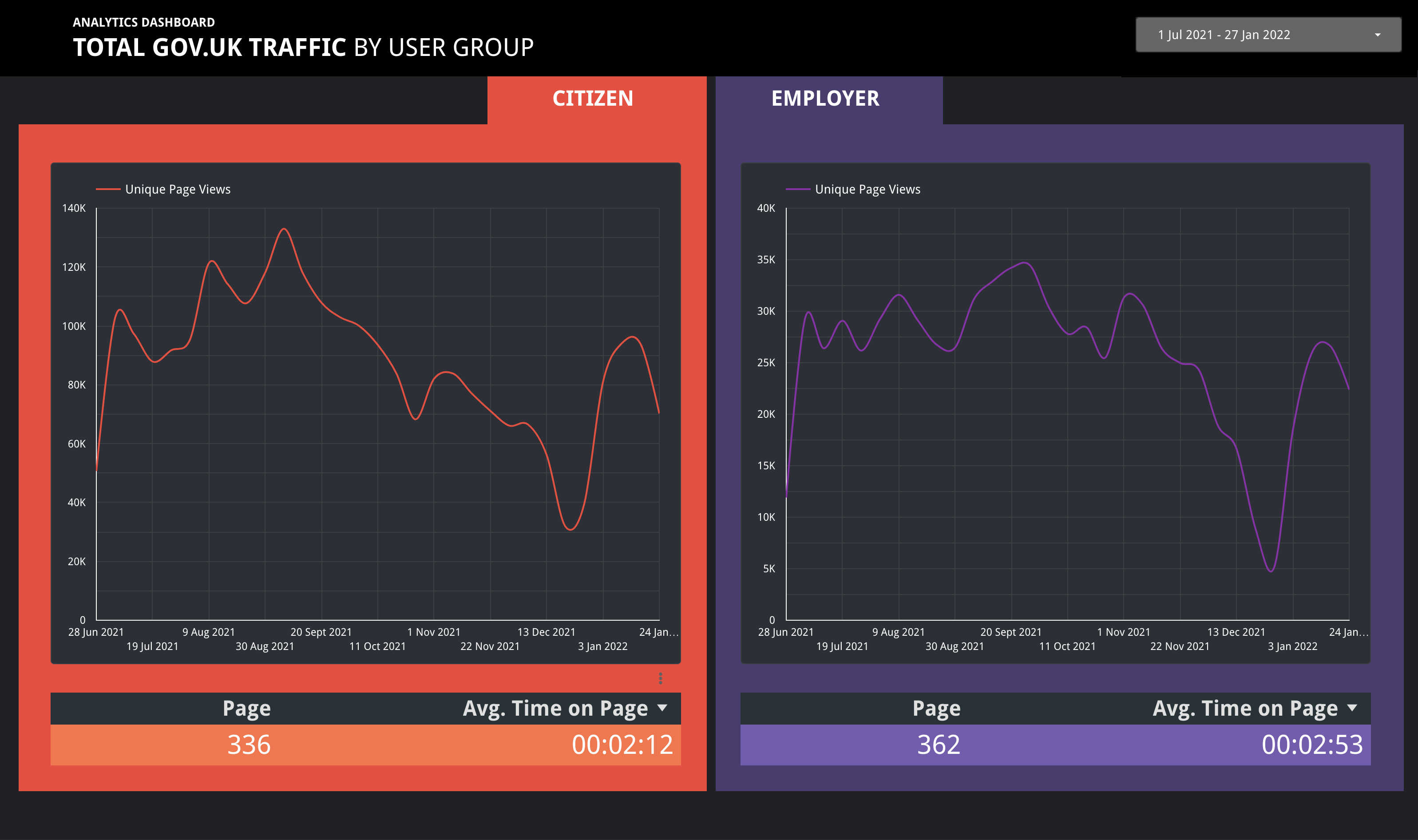
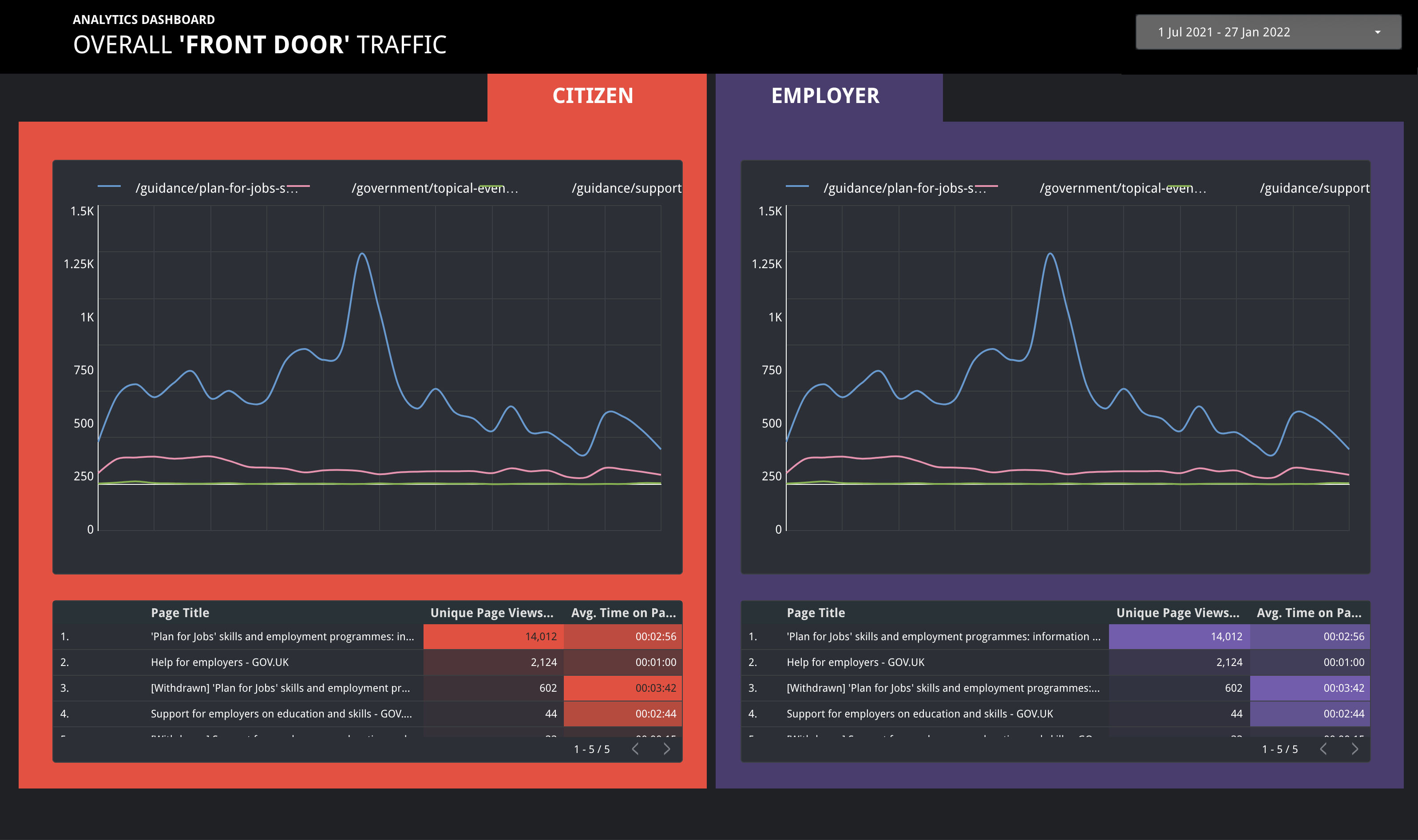
UX Taxonomy and Analytics
Part of my process of research and analysis consists of undertaking an exhaustive UX taxonomy of all existing customer-facing pages.
Partially to understand the existing online services myself, and to flag any problematic pages / interactions. This assessment is supported by objective performance data taken from examining the Google Analytics analysis of each page, tracking 5 metrics:
- Unique Page Views
-
Avg time spent on page
-
Approx reading time
-
Approx reading age
-
Number of CTAs per page
With these 5 metrics, you can see whether a page is getting traffic, and judge whether people are able to find the information they need,
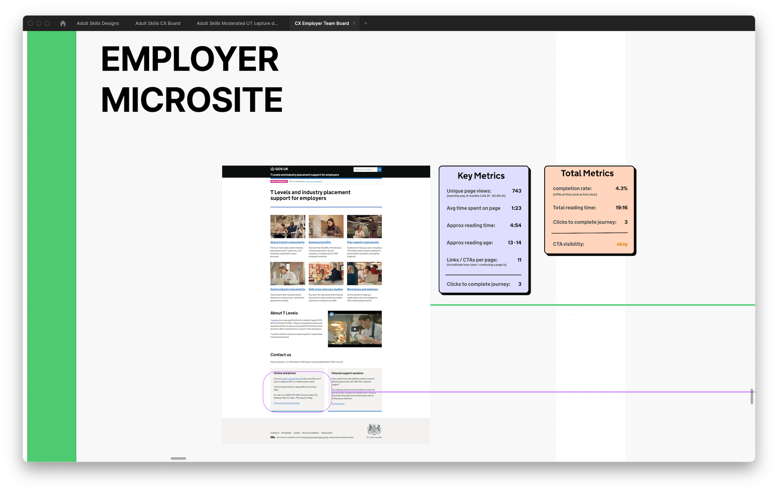
Beyond this, I gathered total metrics for each user journey (as pictured in the red box in the above image). This allowed me to quantify the overall user experience of a collection of pages, by tracking 4 metrics:
- Completion rate (% of users who reach the end page)
- Total approx reading time
- clicks to complete the journey
- CTA visibility
This enabled me to build up a picture of the complex landscape and locate our problem areas.
Deliverables


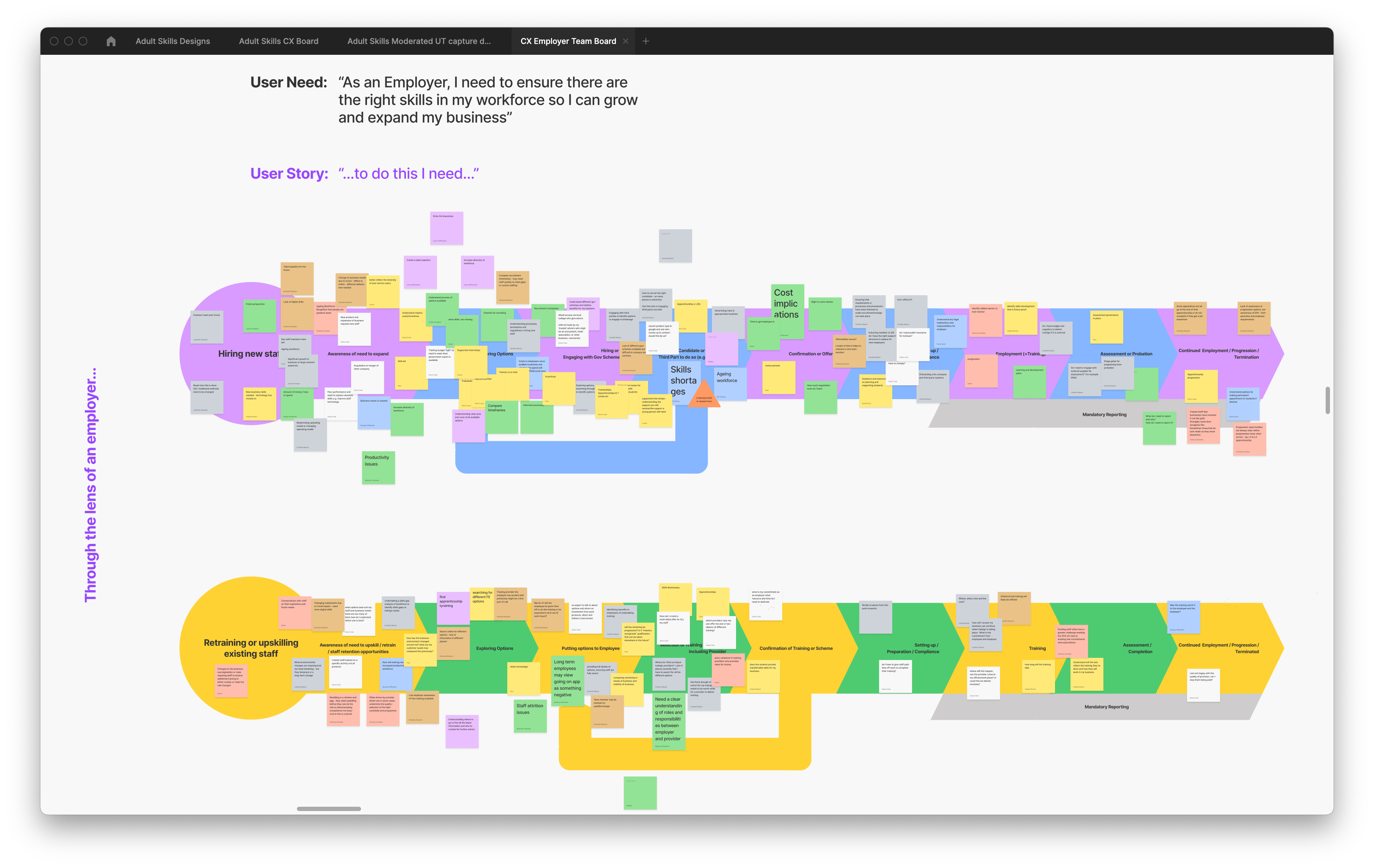
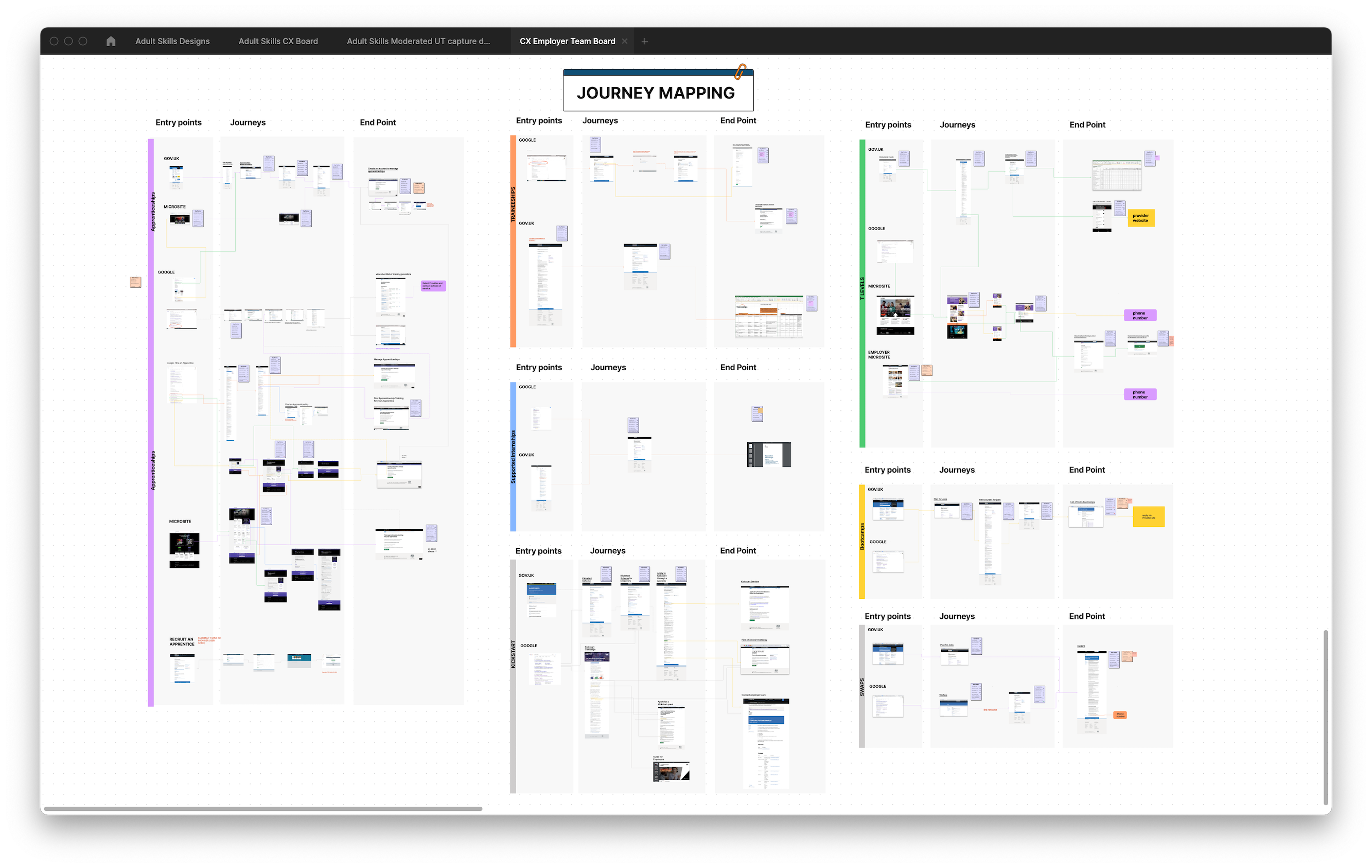
‘As is’ & ‘To be’ user journey maps
UX site map of prototype site
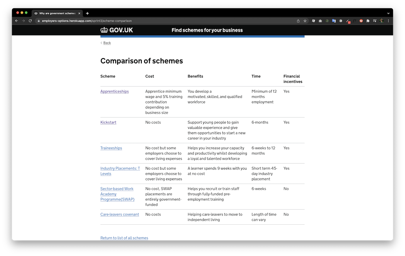
The next step was to creating ‘as is’ & ‘to be’ journey maps, and service blueprints which mapped all DfE’s schemes for employers and their interactions.
As well as acting as a tool to examine the service landscape from a high-level perspective, it also aids in communicating the issues to senior stakeholders to gain understanding and support for the project.
We then worked on prototyping an MVS (Minimum Viable Service) through rigorous rounds of quantitative, and qualitative user testing.
Prototyping


prototypes tested over 7 rounds of usertesting
We (an interaction designer, a content designer, and I) designed 4 ways in which the site could work, whilst maintaining compliance with Government Digital Service and accessibility standards.
We distilled the written content down to the essentials, rewriting it in plainer language to make it more accessible and understandable.
The designs can be viewed above, the 4 archetypal designs were:
-Grid
-list w/ details
-comparison table
- questionnaire
The prototypes were then tested and iterated over the course of 7 sprints.
Testing
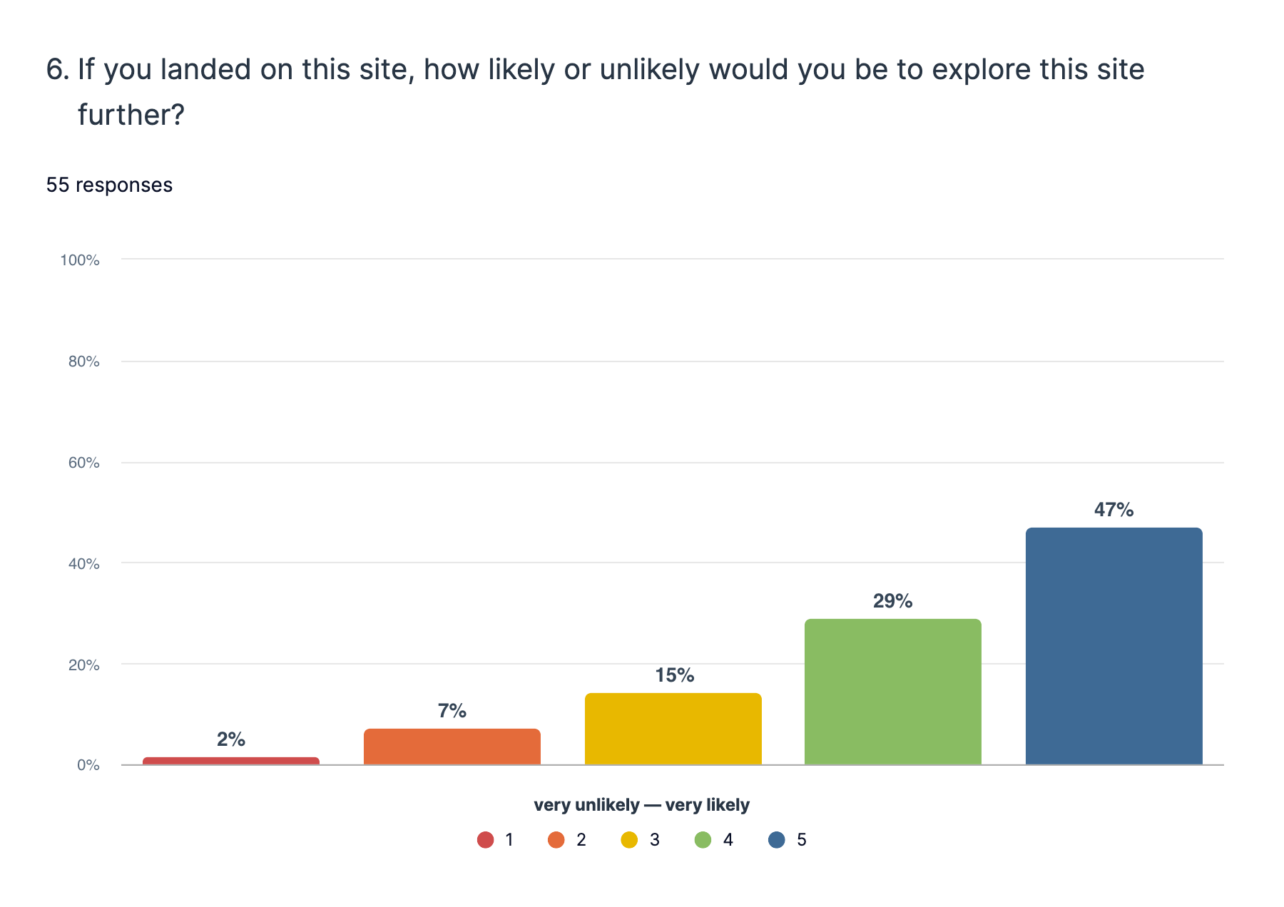
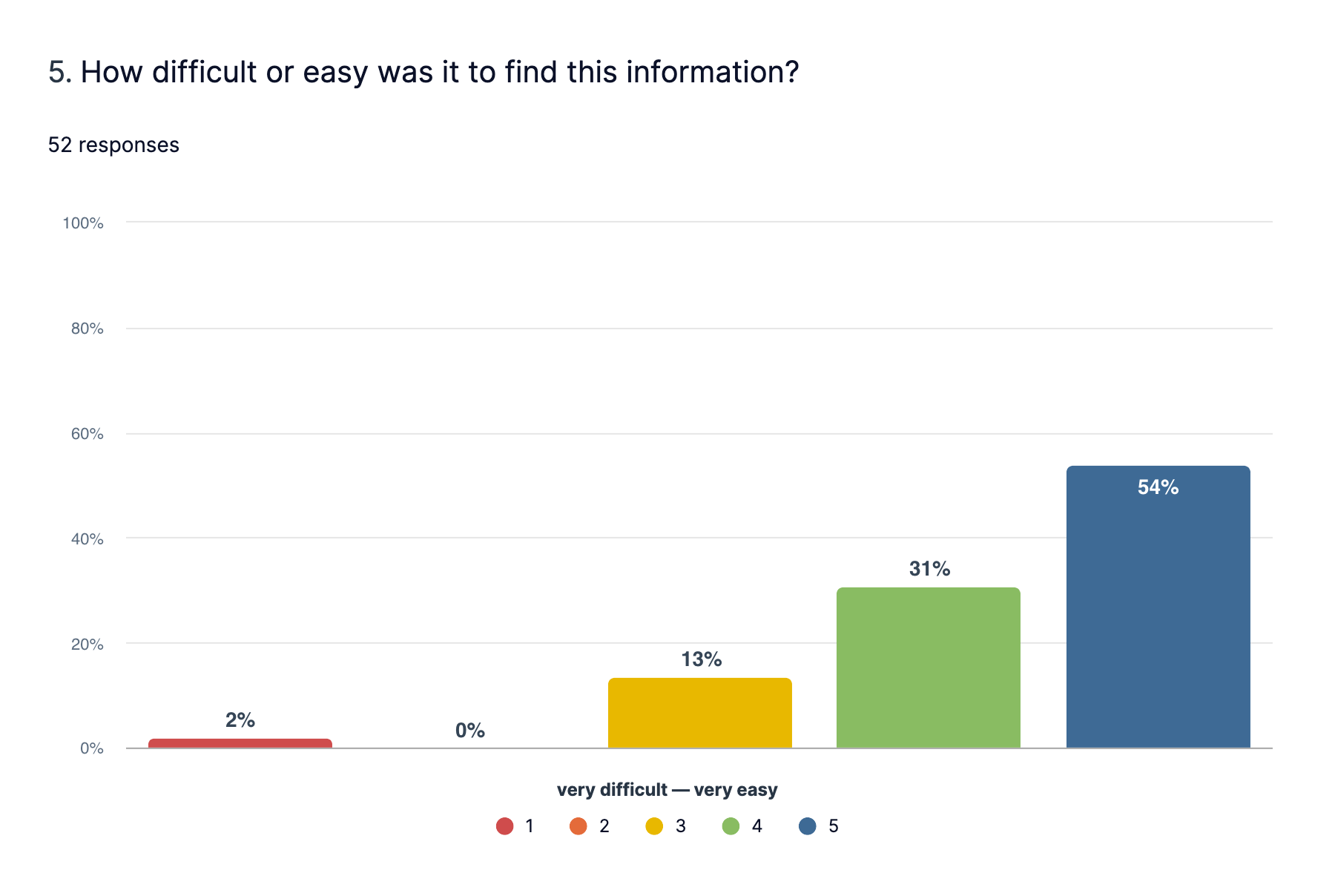
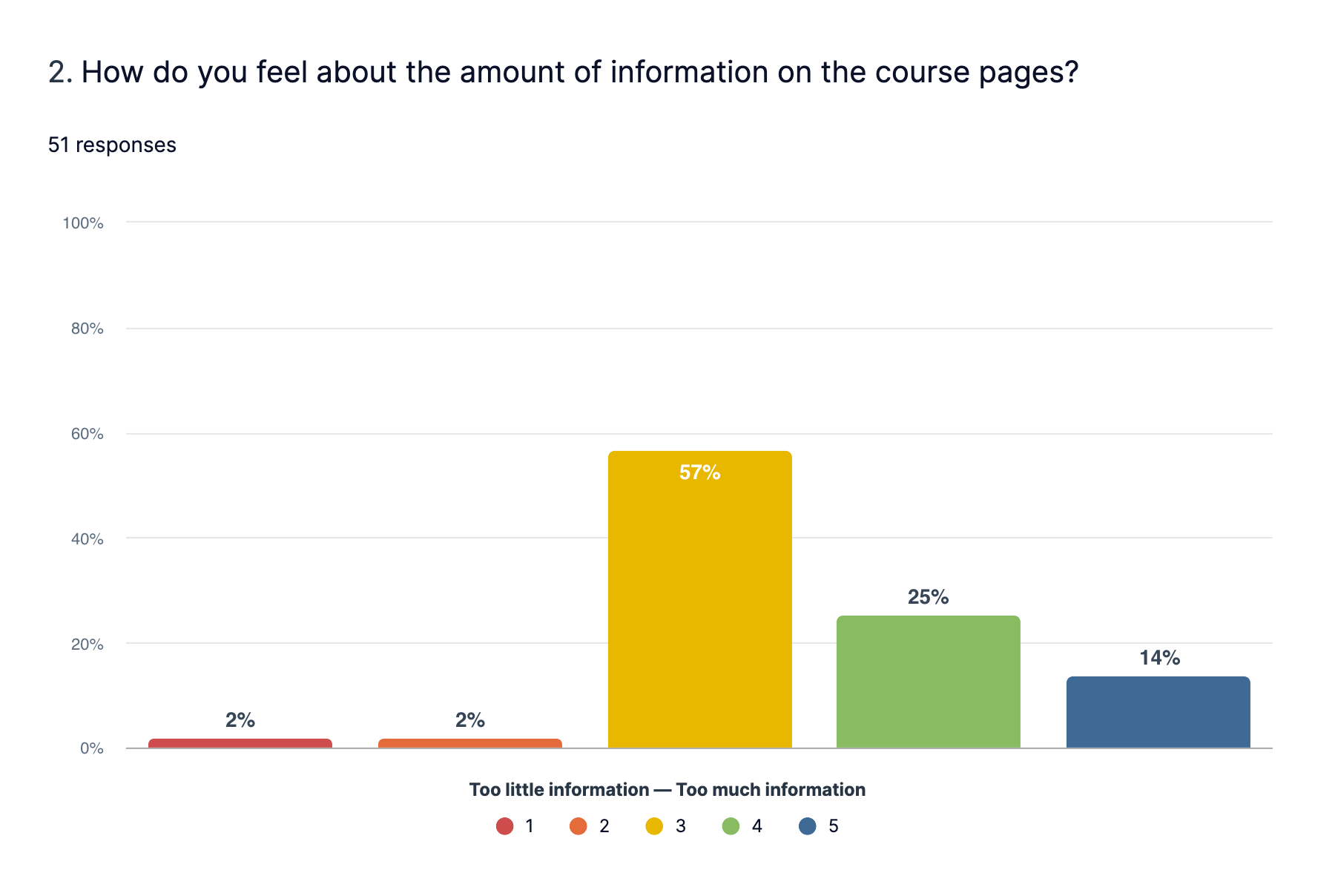
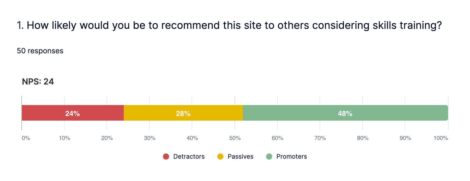
For quantitative testing, we sent out the prototype to over 200 users via UserZoom to test the usability of our prototypes. We asked users to complete tasks such as ‘find out how long a traineeship typically runs for’ and ‘how would you sign up to an apprenticeship’.
We benchmarked the results by asking users to complete the same tasks on the preexisting government services that we were replacing.
The results showed that our designs performed faster and clearer than the current existing government services, based on these 3 key metrics:
- Success rate (%) of questions / tasks
- Time taken to complete tasks
- 1-7 scores for ease of use, visual preference, level of information.
For qualitative testing, we carried out qualitative interviews with over 35 employers, tasking the hiring manager (or equivalent) to test out our prototypes and provide feedback.
Findings
An interesting finding was that our optimised ‘grid’ design was the preferred choice, but that the ‘list’ design enabled the user to find their required information faster and easier.
This sparked a testing of a hybrid design which took the best performing aspects from each design.
Overall, our prototypes were tested over with 200 employees via quantitative testing and 35 employers in qualitative testing, over the course of 7 sprints.
Launch
The Employer site launched on 7th January. View the ‘Find training and employment schemes for your business’ site.
Citizens
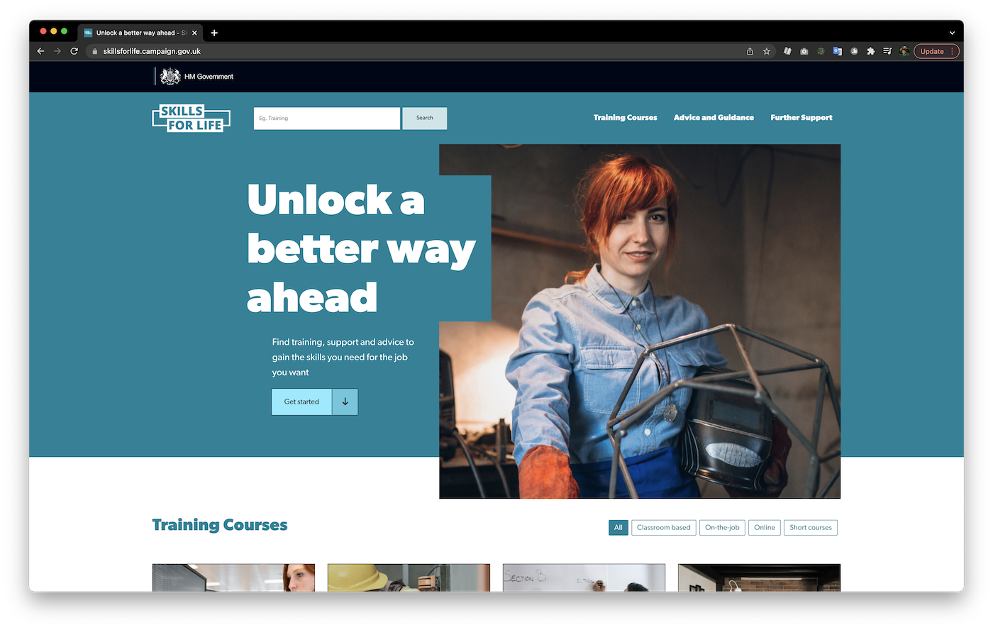
Due to the success of the Employers project, I was asked to lead on the Customer Journey for the Department for Education’s Skills for Life Campaign - a £4m campaign as part of the government’s Further Education reform.
I worked closely alongside M&C Saatchi in a 4 month project to co-design the UX and UI of the campaign site, guiding the design direction via extensive quantitative and qualitative user research.
The Skills for Life campaign launched on 24th January. View the Skills for Life campaign site.
Research
With only 4 months before the launch of the new campaign site, I was asked to lead the customer experience for the campaign.


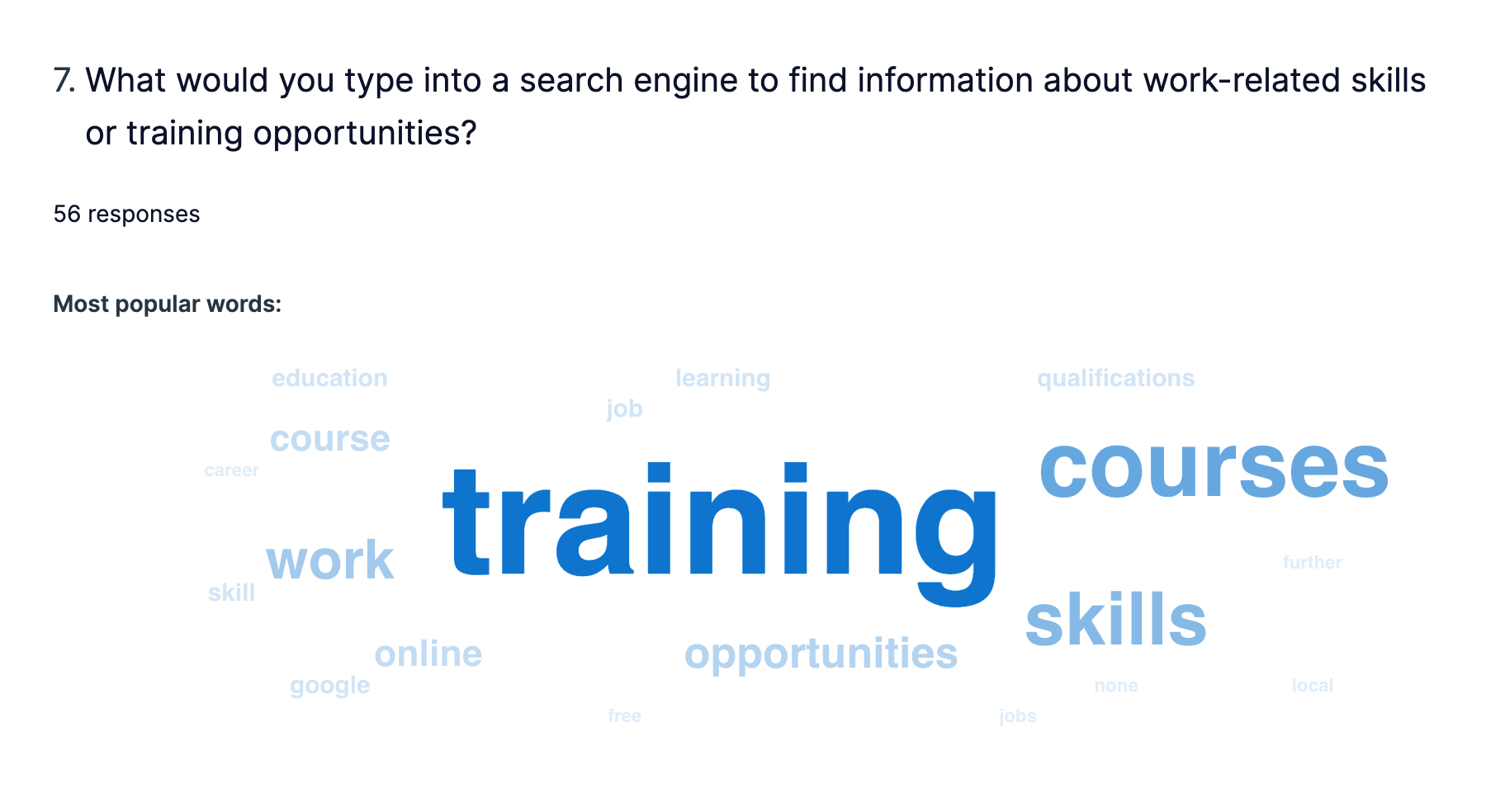
survey of how users’ source their information
I carried out a poll of 100 people to find out how they naturally search for information, particularly related to training and education.
The poll revealed that search engines were the primary method of search, moreso than guidance from friends & family or school / workplace. It was clear that the site we launch would need to perform well organically in SEO.
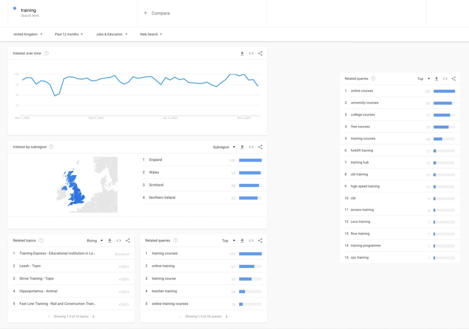

popular search terms and SEO performance data
I collected popular search terms from the survey and ran their popularity through Google Trends to definitively find the most popular training related search terms used across the UK.
I searched these terms on Google to examine the which gov.uk pages rank high in SEO.
The research showed that the most effective method was to name sites similar to users’ organic search queries. It is equally as effective as paying for promotion, and has the added benefit of longevity.
Deliverables

early project recommendations
After providing initial recommendations, I mapped the preexisting user journeys and created a 'to be' user journey and site map.
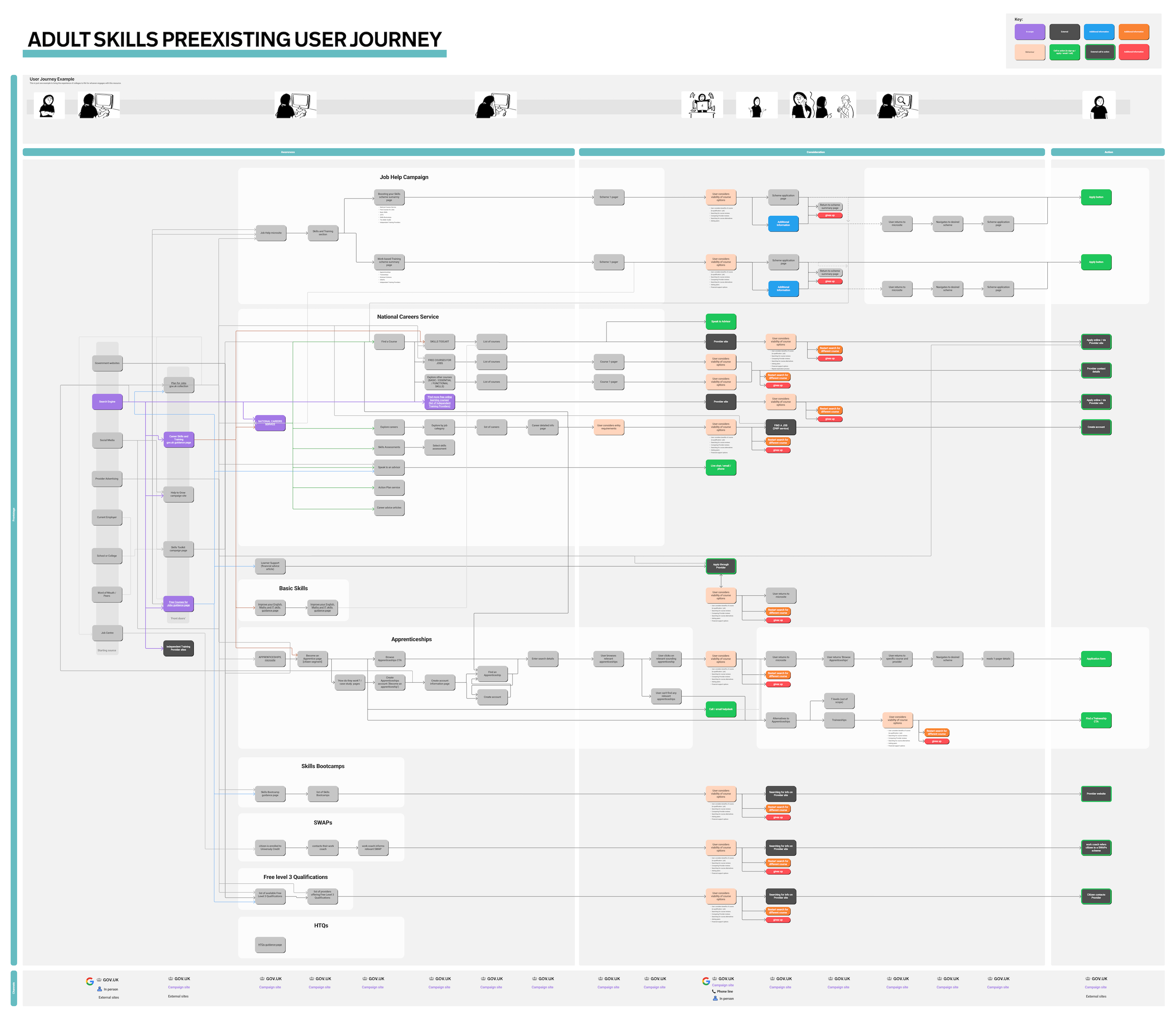
‘as is’ user journey map
The improved journey provided one single site for users to read about free training courses and the different options within that.
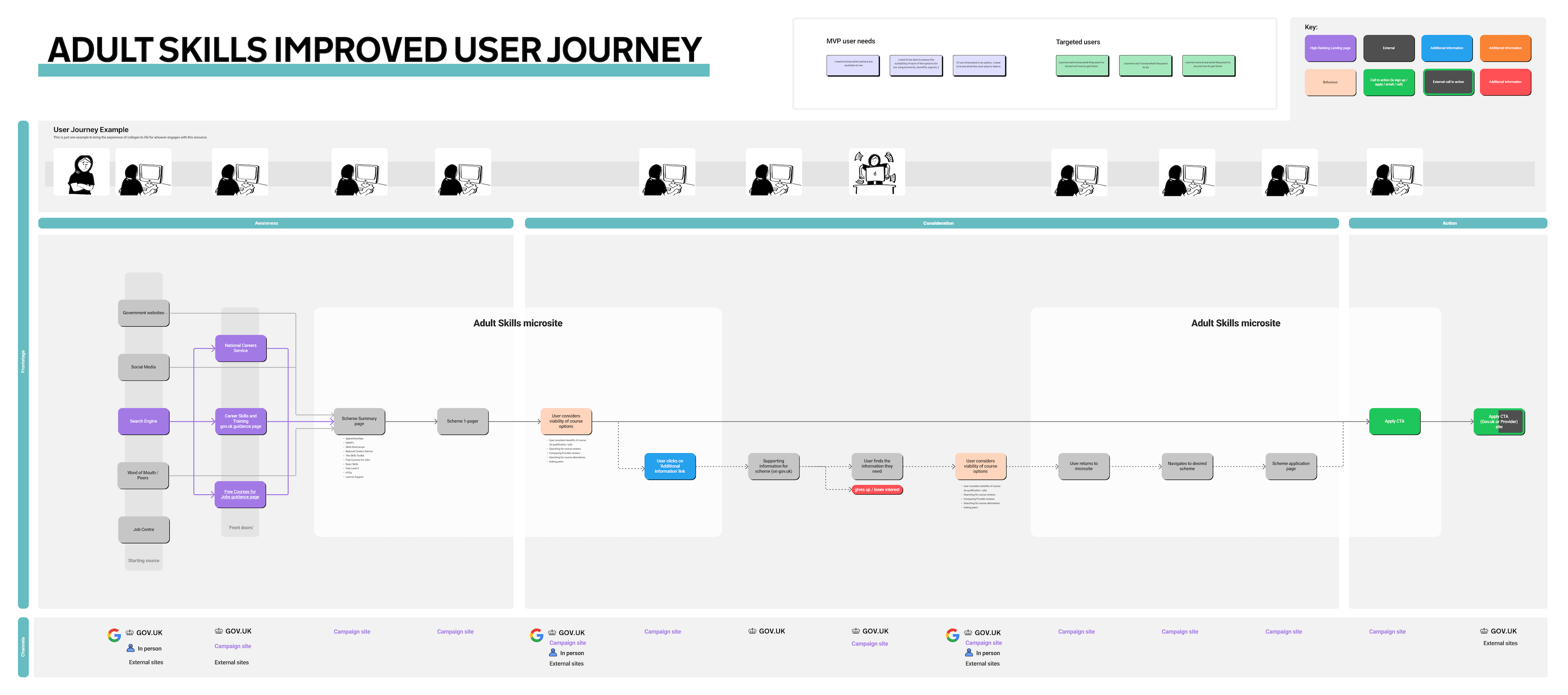

‘to be’ user journey map and site map
From prior user research, we found that users tended to take a break from their research before committing to a large decision.
Typically, they would go away and think about it, or discuss it with their friends or family.
This key research made it important that we consolidate the (preexisting) numerous gov.uk pages into a single website which is easy to return to.
Prototype
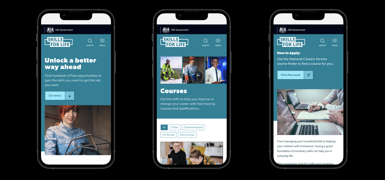
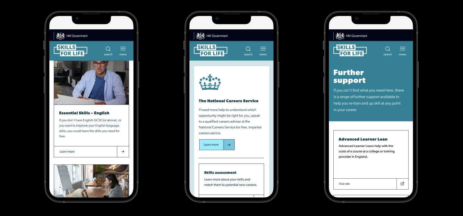
mobile prototypes
I worked closely with M&C Saatchi to design the UX and UI of the site. The user research I conducted informed the structure of the site.
We designed it primarily for mobile, because previous analysis showed that 80% of our traffic accessed our services via mobile.
User testing


I conducted user research to further refine the design and content of the site. I worked closely with content designers to make the language more plain and to standardise the source material, to make the comparison between courses easier.
I tested the 200 people to optimise the content length and complexity on the site, as well as the architecture and UX of the site.
Launch
The Skills for Life campaign launched on 24th January. View the Skills for Life campaign site.
Our team has been nominated for an internal award for the successful handling and launch of the new service in a short time-frame.
............ Additional learning ............

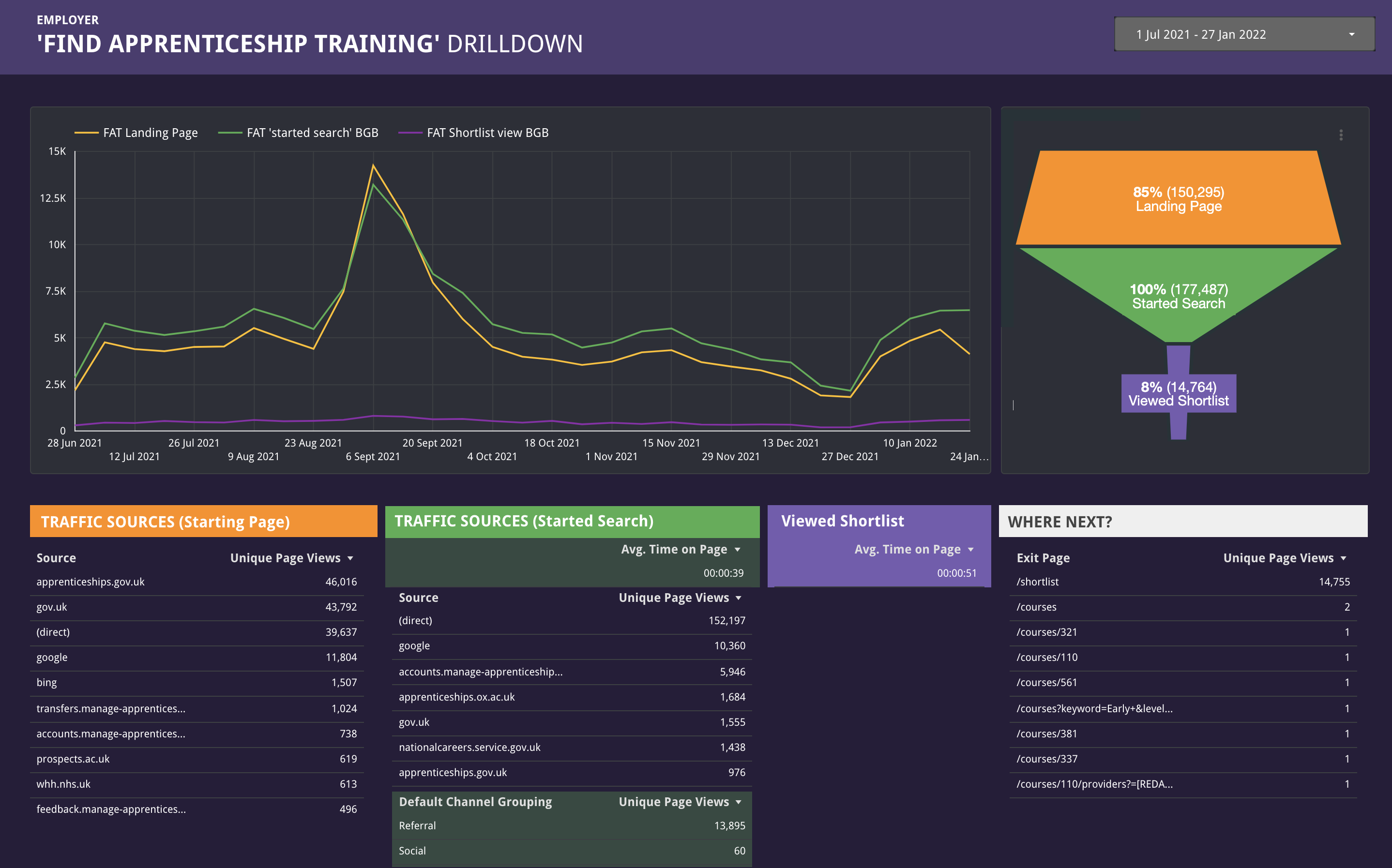
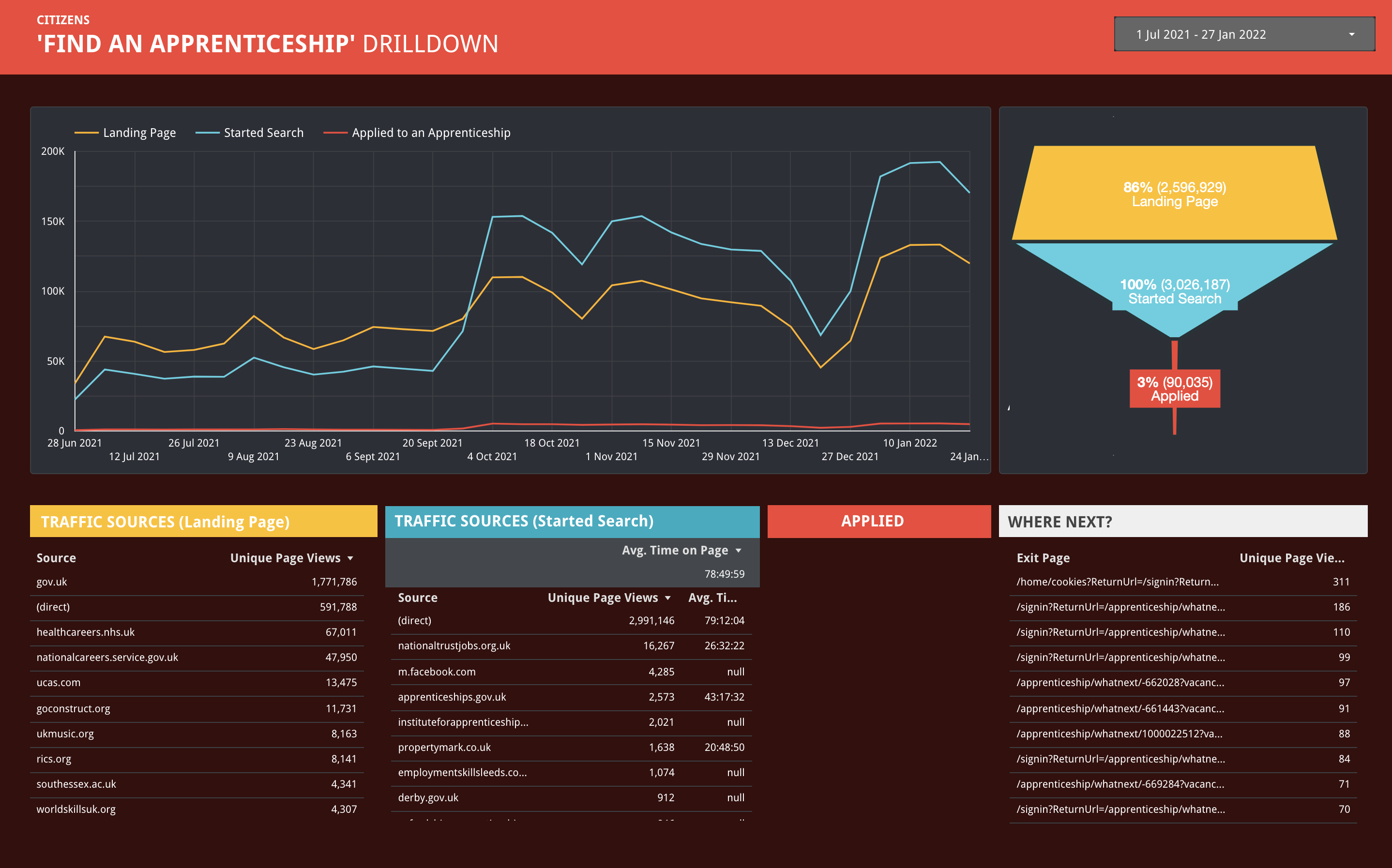
analytics report of employer and citizen-facing go.uk pages
Alongside this work I expanded my skillset, teaching myself UserZoom (a user research tool) and Google Analytics. Both of which have been instrumental in informing the direction of our projects.
....................................
If you would like to hear more about my work for DfE,
please contact me at olly@ollydonovan.com
olly@ollydonovan.com